Graphical Excellence and Integrity
Introduction
Data integrity refers to the concept of telling the truth with data. I am sure at one time or another you have run across a graph that started at a value other than zero, remarked that there was a huge difference between the things being compared, then realized they were actually really similar because the axis was based on a value other than 0.
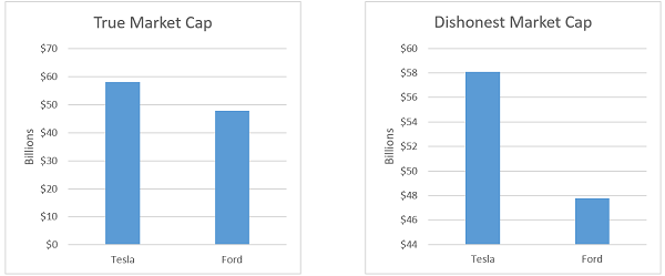
In this example the axis starts at $0 for the chart on the left and $44 billion on the right chart. Nothing is factually incorrect but the visualization is fairly dishonest. There are quite a few ways you can end up misrepresenting data, we will talk about a couple of the more common ones.
The other topic is data excellence. This is display data clearly and efficiently. The following is an example of a chart which does very little to convey information but has a whole lot of extra visual junk.
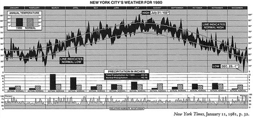
On the other hand this chart packs a whole lot of data in a small space with little wasted ink or space. It is possibly dense to a fault depending on the audience.
Graphical Integrity
Lie Factor
Edward R. Tufte defines the lie factor as the ratio of the effect size shown to the actual effect size in the data. Some times we can accidentally misrepresent data, other times we might intentionally misrepresent it. Consider the following graphic depicting changes in fuel economy standards:
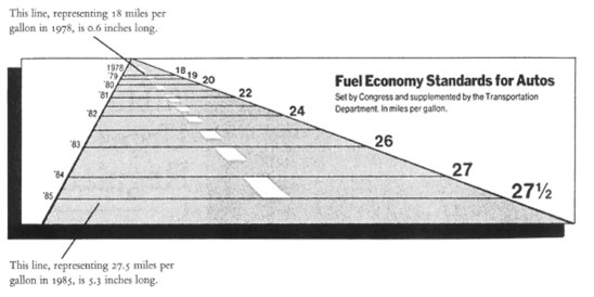
New York Times, August 9, 1978
Note the lines at 1978 and 1985. It would seem they are trying to indicate that the length of the bar represents the measure of the fuel economy standard. But if you measure the bar at the top, it is 0.6 inches long, the bar on the bottom is 5.3 inches long. So it grew by 783%. On the other hand the fuel economy requirements only grew by 53%. This is a rather significant misrepresentation of the data.
A simple scatter plot with years on the X axis and mpg on the y axis would have been sufficient and accurate.
Data Dimensionality
One of the more important things to do with your data visualizations is to make sure the number of dimensions you are representing in your visualization matches the number of dimensions of you data. These dimensions need not be spacial (though the can be), they might include:
- Position
- This one is actually spacial, it might be 2d or 3d space you are visualizing with x, y or z corrdinates corresponding to an attribute of your data.
- Color
- This is a popular tool to distinguish between data. You might color counties or states on a map. If that is all your doing, this does not really map to a dimension of your data. But if you are doing something like having the hue map to a value, then it does
- Time
- You can animate visualizations and if so, the progression over time in your animation is a dimension that should map to your data. This might be temporally, but it also might not be.
- Size
- The length, area or volume can correspond to your data. But be careful with this one, length should correspond to 1d, area to 2d and volume to 3d data. But keep in mind the human eye is really bad at translating changes in area and volume into actual numerical changes. Doubling the radius of a sphere increases its volume by eight times. The eye and brain is not good at making sense of this.
I have seen a visualization that looks a lot like this:
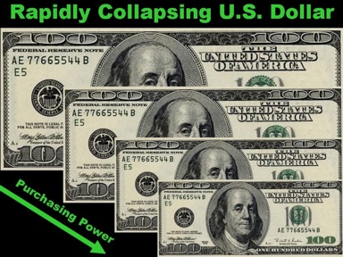
many times. There are no actual scales on this particular image that I found, but suppose there were. One might label each bill with a year and use the x-axis as a percentage of purchasing power. This would be problematic. We see the last bill is about 1⁄2 as long as the first bill, so one might figure it has 1⁄2 as much purchasing power according to the visualization. But it is 1⁄4 the area. Now you would need to figure out if the author meant to measure area or distance and if it was area, that isn’t a great option as mentioned in the previous section.
I have seem similar visualizations featuring barrels of oil representing the price of oil. This is even more problematic because they are changing in volume, but often measured just using their height.
Keep the dimensions of your data matching the dimensions of your visualization.
Normalization and Currency
One of the most visualized items in existence is probably the government budget. Consider the follwing image that shows the New York state budget in the 60’s and 70’s
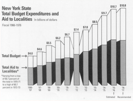
New York Times, February 1, 1976
First off, the 3d effect does some odd things with perspective. The final two columns are nearly indistinguishable in height, a little less than 1% difference, but the perspective makes the last column look larger because the hight not change but it appears further away.
But that is minor, that would be a tiny lie factor. The bigger issue comes in the form of normalization and inflation. Looking at this graph you would conclude that the budget has been growing quite dramatically. But, according to Tufte’s analysis the budget from 1970 to 1977 did in fact not change in a meaningful way. This was a period of significant inflation and the population of New York increased as well.
So the budget per capita, once corrected for inflation, is actually nearly flat from 1970 to 1977, with fluctuations being within a 5% range. The takeaway is that one needs to be careful figuring out what data ought to be normalized to and how the value of currency changes over time.
There are certainly times when you may not want to normalize or account for inflation, but typically the default should be to do so rather than to not do so.
Graphical Excellence
The next topic is graphical excellence. To some extent, this is something you will not want to worry about for awhile. The topics covered here are things you can start thinking about when you can change the look and style of your visualizations comfortably. To start with, simply getting an accurate and reasonably clear representation of your data is what you should be aiming for.
With that out of the way Tufte lists nine things excellent graphical displays should do uin his book The Visual Display of Quantitative Information:
- show the data
- induce the viewer to think about the substance rather than the graphic design or technology
- avoid distorting what the data have to say
- present many numbers in a small space
- make large data sets coherent
- encourage the eye to compare different pieces of data
- reveal the data at several levels of detail
- serve a reasonably clear purpose: description, exploration, tabulation, or decoration
- be closely integrated with the statistical and verbal descriptions of a data set.
It should be apparent that many of these principles are important to data science and some are even more important when looking at large data sets.
Data Ink Ratio
Consider the following two visualizations
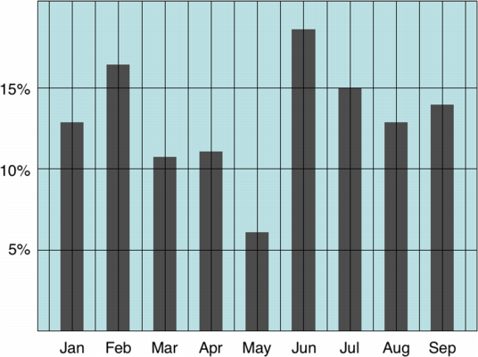
Low Data Ink Ratio
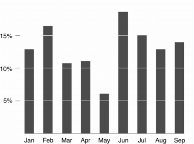
High Data Ink Ratio
Many of the principles above can be boiled down to maintaining a high data-ink ratio. That is, we should display as much information as possible with as little ink (or pixels) as possible. In the former image there are grid lines running across the entire visualization and a solid background. That is all wasted ink that isn’t conveying anything and is just taking up visual processing power.
In the latter image the border and grid lines are removed. In addition the bars are demarcated with an absence of ink rather than the presence of ink. So we can still see where the 10% line hits a bar but we did it by using less ink, not more.
This is one of those things that needs to be done in moderation. One can end up displaying too much data with too little ink which simply overwhelms the viewer but in principle one should not add stuff to a visualization unless it is the data or adding very clear value, like labels on an axis.
Consider this graphic
This graphic has done a overall pretty good job of packing a lot of content into a little space. But it does so with the use of quite a bit of ink. Some of it is important, for example, there are three different displays of data here. Without the shading of the background it would be difficult to tell where one begins and the other ends. Maybe it could have been accomplished with a stronger border, or maybe the background shading is needed. The grid lines could probably be removed as previously shown and that would clean this up a whole lot. But generally this does a good job of directly showing a lot of data.
A Look at a few Visualizations
Review
This class focuses more on the technical aspects of most topics, but this is an important one to at least touch on in terms of aesthetics and design. Being able to wrangle data and get it displayed on a scatter plot or bar graph is one thing. Actually considering what sort of visualization to use or what elements to add is another. As alluded to earlier, don’t let this get in the way of actually producing results. Getting things like subtractive grid lines to work in bar graphs is actually a fairly challenging endeavour and something you would probably want to write you own custom class to reuse. For now, just get it done and recognize what could have been better.